• About
  • Kitchen Confidential! 8 Ways to Prep for Resale!

marthawolford

~ This WordPress.com site is the bee's knees

marthawolford

Monthly Archives: March 2016

Louisville’s Move or Improve

28 Monday Mar 2016

Posted by marthawolford in home building, Remodeling

≈ Leave a comment

What’s the next step for your home? Is it time to make enhancements to your current home or time to move into a home that best suits your needs? We’re here to help you make that all important decision. And benefit financially.
move or improve
 
When you participate in Louisville’s Move or Improve program, you receive a unique opportunity to benefit from architectural planning and design. You will get a specific road map of your options and could be featured on television! Our experts in lending, remodeling and real estate have decades of experience to share. Let us show you the value and potential in your home…or we will introduce you to one that better fits your lifestyle.
Your next step is easier than you think. Contact us for our free consultation. Let us evaluate your options so that you can come to the most informed decision possible.
Commonwealth Bank and Trust

DONNA HARTLAGE   MORTGAGE DIVISION

Mortgage Loan Originator | NMLS #459625 502.259.2927 | donna.hartlage@cbandt.com

Donna, has over 15 years of experience in mortgage lending. She takes pride in keeping up with the ever-changing mortgage industry. Donna will listen to your needs, wants and concerns and provide you with the best mortgage product available.  A home is one of the biggest purchases you’ll make in your lifetime. Whether, you’re a first-time homebuyer or a seasoned professional, Donna will help you find a product that fits your lifestyle.

Wolford Built Homes


                   MARTHA WOLFORD   BUILDER/DESIGNER                     502.228.5885 | martha@wolfordbuilthomes.com

Martha Brown Wolford is a managing partner and lead designer for Louisville’s premier luxury homebuilder and remodeler – Wolford Building & Remodeling. Over the last 40 years the company has built over 600 homes in the Louisville area and created an extensive portfolio of the cities’ most memorable remodels. Martha brings a unique perspective to each project and aspires to create living spaces that are both “cutting edge” and “value-conscious.”


berkshire hathaway

                                   
                                                 ELLEN G. SHAIKUN                                                                     Broker / Associate | 502.417.7625 | eshaikun@gmail.com

Ellen is a determined, enthusiastic, multi-million-dollar producer. Her expertise in marketing and negotiation are key advantages in this field. She has a caring, straight-forward, service-driven approach, which makes her more than just a salesperson. Ellen is an advocate for her clients and her dedication extends beyond the purchase or sale of your home. She knows that the process is a physical AND emotional transition, and she’s here to make sure you’re in the right hands the entire time.

LOUISVILLE’S MOVE OR IMPROVE WAS JUST AWARDED TWO AWARDS BY THE BUILDING INDUSTRY ASSOCIATION OF LOUISVILLE !!!

AND OUR FIRST PROJECT SOLD IN JUST FOUR DAYS!!!!

awardAWARD2
Louisville’s Move or Improve is not a contest. It is a free consulting program for homeowners who are experiencing a dilemma on what their next step should be. We offer expertise on the choices available to you and guidance to help you make the best possible investment for you and your family.
VISIT OUR WEBSITE TO TAKE ADVANTAGE OF THIS FABULOUS OPPORTUNITY!
www.louisvillesmoveorimprove.com 
socialnetworking_facebook_icon_116x24
Wolford Building and Remodeling
will partner with you every step during this process!!
 Contact us today!!
www.wolfordbuilthomes.com 


Four More Ways Vermeer’s Work Can Leave its Mark on Your Home

21 Monday Mar 2016

Posted by marthawolford in Interior Design

≈ Leave a comment

In my blog last week I discussed four ways Johannes Vermeer’s paintings can shape your home’s interior.  Although you may think you and the 17th-century Dutch artist are worlds apart, you will find these ideas still hold true today.  I am now including another four classic styles gleaned from Vermeer, who was one of the greatest painters of the Dutch Golden Age.

Shown: Girl With a Pearl Earring (1665)

1. Add drama with dark walls. Vermeer was a master of painting light. The contrast between his delicately lit subjects and dark backgrounds is dramatic and elegant.


Traditional Bathroom by London Interior Designers & Decorators Godrich Interiors


You can mimic Vermeer’s moody hues by painting your walls a dark hue. However, dark walls aren’t right for every space or aesthetic. Unlike whites, which are expansive and make a space feel larger, darks make a space feel smaller and more intimate.

Dark walls are a good choice for a room you want to make feel cozy, usually smaller spaces like a den or bedroom. In the bathroom shown here, it makes the sculptural sinks stand out. Coincidentally, this bathroom is painted in Farrow & Ball’s Hague Blue.

Painting the wood trim the same color as the wall helps maintain value cohesiveness versus breaking up the scheme with a light-colored trim.

Shown: A Young Woman Seated at a Virginal (1670-72)


2. Try out a blue and yellow room scheme. Despite living in financially delicate circumstances, Vermeer insisted on using the rarest and most expensive pigments, such as ultramarine blue, lead-tin yellow and vermilion red. Yellow and blue are the predominant colors in many of Vermeer’s paintings.

Traditional Dining Room by Chagrin Falls Interior Designers & Decorators W Design Interiors


Blue and yellow go together remarkably well. While they’re not quite complements on the color wheel, they’re near cousins. (Blue’s complement is orange; yellow’s is purple.) Paired together, they create a pleasing energy that’s abuzz with nature tones. Yellow reminds us of the sun, and blue of the sea or sky.

Blue and yellow also balance each other’s color temperature – blue is a cool color, while yellow is a warm one. The duo in this living room and dining room transition is harmonious and striking.


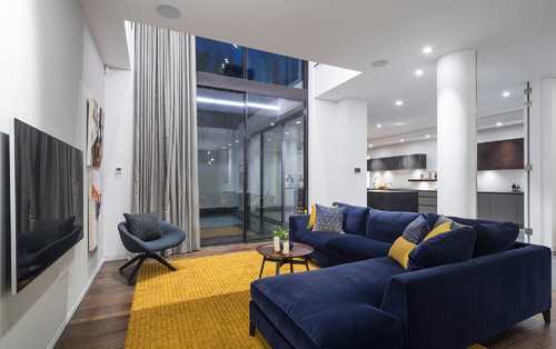
Contemporary Living Room by London Photographers Tony Murray Photography


The combination of blue and yellow looks terrific in contemporary spaces too. This otherwise neutral home in London relies on the furnishings for color and texture.

Shown: Officer and Laughing Girl (circa 1657)

3. Map out your home. About half of Vermeer’s paintings show a large map on the wall. Jonathan Janson of The Vermeer Newsletter says maps were made for practical purposes, prestige and home decoration. In Vermeer’s day, they were a cheap way to embellish bare walls and exhibit Dutch mercantile domination of world trade. Janson says the maps were generally glued on heavy cloth and hung on rods. Balls on the rods kept the maps away from humid walls.


Contemporary Living Room by Toronto Kitchen & Bath Designers Toronto Interior Design Group | Yanic Simard


Maps are beautiful in their own right. They’re also a way to personalize your space with a location that holds special significance, like a hometown or favorite vacation spot.

Today, maps are more likely to be framed than hung, but glass size can pose a logistical problem. If your map is too large to frame (and it isn’t of significant historical or financial worth), consider breaking it into sections. This large map of Paris is handsome framed in four pieces.


Shown: The Milkmaid (1660)


4. Accept imperfection. Japanese culture has an aesthetic called wabi-sabi that’s focused on transience and imperfection. It’s unlikely Vermeer knew of this concept, but he hinted at it in his paintings. Look at the walls in The Milkmaid. See any crumbly, bumpy plaster under the window and above the baseboard tile? This is likely how the walls were, and Vermeer chose not to make them look new and smooth in his painting.

Although it isn’t advisable to put off the repair of crumbling building materials (you need to get to the heart of what’s causing the damage), there are instances when leaving things alone makes sense. Honoring old materials and celebrating how they change over time can be powerful.


Eclectic Bathroom by Metairie Interior Designers & Decorators Logan Killen Interiors


These brick and stucco walls are nearly 200 years old and were uncovered during a renovation. Just as Vermeer didn’t edit out the wall damage in his painting, these designers didn’t want to cover up these walls with new material, but rather showcase their history instead. So they secured loose areas, and left the walls and wood beams exposed as they were.


Are you interested in renovating or building your dream home?

In business over forty years, Wolford Building and Remodeling

has the expertise to create a home that is a Work of Art!!

Visit us at:

http://www.wolfordbuilthomes.com


Four Ways Vermeer’s Work Can Make Its Mark in Your Home

14 Monday Mar 2016

Posted by marthawolford in Uncategorized

≈ Leave a comment

Even with only about three dozen paintings to his name, Johannes Vermeer is considered one of the greatest painters of the Dutch Golden Age. (His Girl With a Pearl Earring painting caused a craze on a recent two-year world tour.) Painted with utmost care and the clarity of a photograph, Vermeer’s paintings mostly depict ordinary domestic scenes, often of ephemeral figures in the crisp northern light inside two rooms of his home in Delft, Netherlands. Although you may think you and the 17th-century Dutch artist are worlds apart, you may be surprised to see how his paintings can shape your home’s interior for the better.

Vermeer                    Shown: The Girl With a Wineglass (1659-60)


1. Install a stained glass window. In Vermeer’s day, stained glass windows were plentiful. Glass was expensive, so windows were made from small pieces of glass held together by lead strips. While stained glass is still made today, it’s often associated with religious buildings or those small decorative artworks held in place by a suction cup.

A stained glass window isn’t just a beautiful piece of art, it’s functional as well. It adds pattern and color, and depending on the glass, it can provide privacy without blocking light.


Traditional Kitchen by Venegas and Company

The stained glass windows in this kitchen are a beautiful focal point and help elevate the other traditional materials in the space.


Victorian Hall by Siemasko + Verbridge
 
Stained glass isn’t only for exterior windows. It’s a great addition to an interior transom, as is this piece found on a doorway in a second floor hallway.
Traditional Kitchen by Charles R Myer & Partners, Ltd
Crown glass also gives you an old-world look but without color. Resembling the thick bottom of a bottle, it’s made of cylindrical glass that’s blown into a globe shape, then flattened.
Vermeer

Shown: The Procuress (1656)


2. Invest in an Oriental rug. Look at most any Vermeer (or 17th-century Dutch painting for that matter), and you’re likely to see an Oriental rug. Vermeer probably included them to demonstrate his talent in rendering all things intricate. While this one is shown draping a woman’s legs, most in his day were used as table coverings instead of on the floor.


Eclectic Living Room by Dillard Pierce Design Associates
Like stained glass, Oriental rugs are prized works of art and will amp up any room.  Patterns, colors, weaving techniques and styles vary greatly. Some have larger, more prominent designs, like this example.  Others are more elegant, finely detailed and less pronounced.
Scandinavian Bedroom by Ashton Woods

If you don’t like the idea of walking on something so exquisite, hanging a rug on the wall is another way to enjoy its beauty. This one serves as a headboard.


Vermeer

Shown: The Music Lesson (1662-65)

3. Checker your floor. Vermeer’s home clearly had checkered floors, and the plucky pattern also showed off his prowess in expressing perspective and depth in his paintings.


Traditional Dining Room by Deborah Scheck
Prominent in 17th-century Holland, checkered floors have never gone out of style. Graphic and bold, they easily skirt between traditional and contemporary, and make a handsome statement.
Traditional Bathroom by Cameo Homes Inc.
Checkered floor patterns can vary in scale, but 12-inch squares set on a diagonal are the norm. Smaller squares can look overly busy if the palette is high-contrast like a black and white, but they can work in smallish spaces. This bathroom floor sports 6-inch marble tiles.
Traditional Kitchen by Design Studio West
If you find checkered floors too adventurous for your taste, you can curb the graphic effect by installing a light border between the dark-valued tiles and selecting an accent color instead of black.
Vermeer

Shown: Young Woman Standing at a Virginal (1670-72)

4. Embellish with a blue and white tile. The city of Delft is renowned for its blue and white pottery. An imitation of Chinese pieces imported by the Dutch East India Company, it’s also known as delftware. The pieces originally had tin glazing, which turned an opaque white when fired. Cobalt blue ceramic glazed patterns were added for decoration. Popular imagery includes windmills, flowers and pastoral figures.

Delftware includes pottery, plates and serving pieces, ornamentals, as well as tile. Here in Vermeer’s painting, delft tile, also known as Dutch tile, is used as baseboard skirting on the wall.

Traditional Kitchen by J.P. Lindstrom, Inc.

Unless you build a windmill on your property, probably nothing will evoke the aesthetic of the Low Countries more than delft tile.

This kitchen uses delft tile as a full-height backsplash behind the cooking area. It’s a spectacular complement to copper pots too.

Traditional Living Room by Hull Historical
Delft tiles are perfect for fireplace surrounds. Be aware that traditional Dutch tiles tend to be thicker and sized differently from U.S. factory-made tiles, so depending on your application, you’ll need to plan ahead to accommodate appropriate spacing.

Interested in incorporating these ideas into your home?

Wolford Building and Remodeling won numerous Awards

from the Building Industry Association Greater Louisville in 2015!

lightingh

Let us remodel or build your dream home!

http://www.wolfordbuilthomes.com

What Matisse Can Teach Us About Interior Design

07 Monday Mar 2016

Posted by marthawolford in Uncategorized

≈ 2 Comments

French artist Henri Matisse, known for his revolutionary use of brilliant color and expressive forms, sought to create work that would be “a soothing, calming influence on the mind, rather like a good armchair,” as he put it. His fearless use of color, pattern and movement transfer well to the world of interior design — so if you don’t have the millions to drop on an original Matisse masterpiece, consider letting the artist’s work inspire your decor instead. Here’s how:
matisse
Shown:L’Atelier Rouge (1911)

1.Don’t be afraid of red. Henri Matisse once said, “With color one obtains an energy that seems to stem from witchcraft.” Sorcery aside, a red palette can certainly be bewitching. Several of the artist’s paintings of interiors use red in abundance. Here, in L’Atelier Rouge, the floor and walls are doused in a deep crimson.

Traditional Home Office by Archer & Buchanan Architecture, Ltd.
Red amps up the energy in a room and gets your heart beating. It’s an excellent choice for a dining or living room, as it stimulates social interaction. These lively walls are painted in a high-gloss Million Dollar Red by Benjamin Moore.
matisse
Shown: The Painter’s Family (1911)
2. Embrace pattern pairings. Here, Matisse portrays his own home in a pleasant frenzy of different patterns. According to Matisse biographer Hilary Spurling, the artist came from a long line of weavers and spent his childhood around fabric, so textiles were in his blood. He amassed a sizable collection of fabrics, which he referred to as his “working library,” and apparently took fabric and Persian carpet swatches with him between studios.
Combining a bunch of bold patterns together might not be as difficult as it sounds. If Matisse pulled it off in his house, so can you. To get the right mix, follow a few simple rules.
Eclectic Living Room Eclectic Living Room
Vary the scale. Piling a bunch of large-scale fabrics together will only make you dizzy. Balance large pattern with smaller portions of small- and medium-scale designs.

For example, the suzani throw on this sofa is a prominent piece with an equally bold design. The two throw pillows on the right side have a simpler, small-scale design that almost reads as textural. Meanwhile, the medium-scale floral pillows on the left serve as a good go-between.


Farmhouse Dining Room by Rikki Snyder
Pick one main background color. Mixing too many colors together in a palette without a main color theme might make your room look busy and disorienting.

The orange here holds the scheme together and gives it a sense of solidity because it’s a similar value (relative lightness and darkness) as the other colors used in the foliage design. If these walls were painted white instead of orange, they would contrast greatly with the design, and likely make the entire installation feel ungrounded and overwhelming.


Eclectic Kitchen by Incorporated
Allow for some breathing room. Going wild with an entire room full of mismatched patterns isn’t for the faint of heart. Most folks feel comfortable using bold patterns in small doses. If this is more your speed, make sure your spirited pattern is placed in a prominent location and doesn’t have competing pieces nearby.

This backsplash is made of fabric laminated onto glass. Like a piece of artwork, its beauty is emphasized not by what surrounds it, but by what’s not around it. Clean lines and neutral cabinets make this installation shine.


matisse
Shown:Conversation (1908-1912)

3. Heighten focus with a true blue. In 1912 and 1913, Matisse visited the Moroccan city of Tangiers. Inspired by the North African light and copious amounts of cobalt blue used in Moroccan interiors, he went on to celebrate the striking hue in many of his paintings.

Eclectic Home Office by Design Manifest

Blue can be paradoxical. A light, watery, pale blue is widely known as relaxing and cooling, but the vividness of a brilliant blue like this one can be energizing. Bright blue can make you feel pleasantly caffeinated versus overly calm.

Because blue is also associated with clear thinking and focus, it’s a great color to use in a home office, sitting room or bedroom. This space is painted in Brilliant Blue by Olympic Paints.

matisse
 Shown: Vase, Bottle and Fruit (1906)

4. Make room for a still life. Matisse created numerous still life paintings of fruit, flowers, vases, guitars and even goldfish. This piece, done in 1906, depicts a fruit-laden tabletop.

Eclectic Dining Room by AS you see it!
This kitchen might be a perfect modern-day Matisse setting. (Even the chair fabric mimics his tablecloth in the previous photo.)

The wire basket filled with colorful apples makes an attractive and edible centerpiece. Swapping out different fruits, flowers and accessories celebrates nature and the passage of seasons. It’s also an easy way to add variety and elegance to your home.


matisse
Shown:La Danse (v. 2) (1909-1910)

5. Add the art of movement. This is one of Matisse’s most famous paintings. The composition of the girls’ encircled arms and twisting bodies add dynamism and excitement far beyond the rectangular shape of the canvas it’s painted on.

Contemporary Living Room by CID Interieur
Here, images of actual dancers add a timeless touch and bring movement to an otherwise static space.
matisse
Shown: The Parakeet and the Mermaid (1952-1953)

6. Consider cutouts. When Matisse’s health deteriorated later in life, he made collages using cutouts of gouache-painted paper. Many of his forms represent birds, marine life and vegetation.

To mimic the look, use fabrics and wallcoverings with designs that capture the graphic spirit of Matisse’s cutouts. This chair is upholstered in a fetching frond design from Raoul Fabrics.
Industrial Bedroom by Jessica Helgerson Interior Design
This custom-made hand-stitched felt headboard is more decorative than Matisse’s designs but still captures their essence. Traditional Hawaiian quilts have a similar look.
Eclectic Hall by Amanda Neilson Interiors
This wallpaper also resembles Matisse’s collages, even though it’s in a softer palette. You don’t necessarily need to go bright to channel his work.
THANK Y0U HOUZZ FOR YOUR CONTINUOUS INSPIRATION!!

Would you like to build or remodel your dream home?  Wolford Building and Remodeling has an in-house design team to help make your interior design decisions at no additional cost to you!

Visit:

marfs bedroom

HTTP://WWW.WOLFORDBUILTHOMES.COM/

Subscribe

  • Entries (RSS)
  • Comments (RSS)

Archives

  • January 2022
  • November 2021
  • June 2021
  • April 2021
  • January 2020
  • November 2019
  • June 2019
  • May 2019
  • January 2019
  • January 2018
  • July 2017
  • May 2017
  • April 2017
  • March 2017
  • February 2017
  • January 2017
  • December 2016
  • November 2016
  • October 2016
  • September 2016
  • August 2016
  • July 2016
  • June 2016
  • May 2016
  • April 2016
  • March 2016
  • February 2016
  • January 2016
  • December 2015
  • November 2015
  • October 2015
  • September 2015
  • August 2015

Categories

  • Architecture
  • Entertaining
  • Floral
  • French Country Design
  • home building
  • Home Maintenance
  • Interior Design
  • Landscaping
  • Luxury Homes
  • New Building Trends
  • Organization
  • Remodeling
  • Technology
  • Uncategorized

Meta

  • Register
  • Log in

Create a free website or blog at WordPress.com.

  • Follow Following
    • marthawolford
    • Already have a WordPress.com account? Log in now.
    • marthawolford
    • Customize
    • Follow Following
    • Sign up
    • Log in
    • Report this content
    • View site in Reader
    • Manage subscriptions
    • Collapse this bar
 

Loading Comments...